- cross-posted to:
- programmer_humor@programming.dev
- cross-posted to:
- programmer_humor@programming.dev
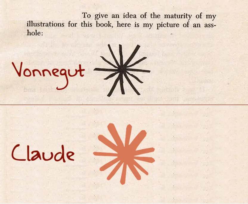
So, which butthole did you pull your code, copy, or image from today? 🙂
I can’t stop laughing.
No single person suggests making a logo that resembles an anus, but when everyone’s feedback gets incorporated, that’s what often emerges.
- 1990s-2000s: 3D and Glossy - Remember when every logo needed a drop shadow and a glassy shine? Apple’s aqua interface set the standard.
- 2010-2013: Skeuomorphism - Digital designs mimicking physical objects, with stitched leather textures and realistic dials.
- 2013-2018: Flat Design - Reaction to skeuomorphism brought minimal, clean interfaces with bright colors and no shadows.
- 2018-2022: Neomorphism - Soft shadows and semi-flat design creating subtle, “touchable” interfaces.
- 2022-Present: The Butthole Era
Somehow Walmart is leading innovation, launching a butthole logo in '07. Truly ahead of their time.
A company’s logo should be evocative of their strengths. So suggesting they, principally, shit all over everything is apt.
This is one of the rare cases where reading the article would probably ruin a perfectly good headline. lol
You’re missing out.

I thought so too, but the article really delivered. I didn’t know I was living in The Butthole Era. I suspected it, but I didn’t know it.
Funny that they praise Slack’s “hashtag inspired logo” when they replaced the original angular one with circular symmetry that looks like a penis swastika.
Because the only thing coming out of them is shit?


