Hi everybody, I’m a UI/UX designer and I wanna contribute to the community here with my expertise. Here is a quick prototype for a Android Lemmy app with Material You Design, it’s a simple and customizable app. With this app, I also want to improve the experience when exploring different servers.
Obviously, this is just a concept, so if any developer interest, I’m very willing to collaborate with 🫡 . Vice versa, if anyone stucks with designing his/her own Lemmy client, just reach out to me and I will give you a hand.
Here is a quick demo of some basic features: https://vimeo.com/843481714?share=copy
And here is the figma file if you wanna take a look: https://www.figma.com/file/ZBR30l0ZcKuyKMPjeDmvdF/Lemmy-Android-app?type=design&node-id=53526-31054&mode=dev
Great work, but super clickbait title.
lol, my bad, I used to be a content writer so it kinda runs in my blood =))) anw, updated for more accurate title
Personally prefer to read the title before the image. It’s one of the reasons I don’t use the Connect app
The connect app now has that as a setting, if that makes a difference for you.
Cool. Thanks
This is something that has been disturbing me with Thunder app, Connect in their latest versions added a switch for this!
Noted. I was also considering where should I put the title as well. This is just a quick prototype to find out whether any dev is interested in collaboration, so just take it with a grain of salt 😉
top would be preferable.
often the title is needed in order to understand the picture - or the picture is the “punchline” to a joke set up by the text.
Me too. That’s what keeps me on jerboa for now.
I switched to Liftoff. I was on Jerboa for the last few weeks as I figured things out, but liftoff is much smoother and has yet to give me an error code
I’m using Connect and your can meme the title be before the image in the settings, that’s what I did
Thanks, must be a recent update. I’ll check it out!
This looks really great! If you’re interested in contributing to an app you should check out Liftoff!
We’re totally open source and community contribution driven and we’re moving fast! But we’re lacking designer contributions!
If you’re interested check out our open GitHub issues/enhancements:
Got that, I’m checking Matrix so we could have a chat
I just discovered liftoff last night on the Playstore. Finally really getting into Lemmy now that I have a good app to use.
I’m putting the final touches on an app using material design. I’ve broken away from cards and haven’t even considered a light mode yet, but I’ve been pretty unhappy with the search/explorer
This just got me unstuck on it, so thanks
I don’t know why, but this exchange felt of fucking romantic. Keep up the good work you amazing people!
Awesome, glad I can help. I also have some design outside of the cards, you can check it out in the Figma link for more inspiration
I think Liftoff would benefit for a Material You UI.
Same. One of the reasons I don’t use it. I think a reason they don’t priotise is because it supports both android and iOS. Not all users would see it.
Yeah I get it, although Thunder is available for both platforms as well, and Material You looks awesome.
Only reason I’m not using it
Just like wefwef is nice for iOS, this seems nice for android
Wefwef works great on Android. Supposedly it looks like Apollo, but so what?
hell i use wefwef on my linux tablet
It very much looks like an iphone app. All the text and the ui elements fit apples theming and looks out of place in android.
Not to say it doesn’t work well or isnt a good app, because it is, but a lot of us are looking for a unified experience.
I’m using thunder, which fits in nicely. Uses Material You theming as well
It works well even on my linux desktop. But in terms of design fits best into iOS
This reminds me a bit of Sync, formally for Reddit. They’re bringing it to Lemmy at some point in the future. Love all the new apps coming out for here, great work :)
I like the look. One thing I would like to see is integration of the community search tool to make discoverability easier. Something that shows what server each community is on but also will allow you to search across servers in case you don’t know where things are, and a way to view the list of all communities if you want.
I’m a fullstack dev building my own app for Lemmy. I’d be interested in opening a dialogue if you’re interested. UI/UX is my weak point :P
Awesome, I just sent u a message
very cool! we need more ux/ui designers in open source and free software!
Wow! Nice one. I think if we all keep contributing Lemmy will be like VLC. Let’s do it !!
hey this looks really similar to a proposal that was made on github for jerboa. Jerboa is also really focused on material UI so maybe it would be best to combine efforts and help each other out.
“Video is not rated. Log in to watch”
Nope.
Can you try again? I think it’s fine now
It works for me.
The apps are certainly in need of all the help they can get. I have Lemur and Jerboa, and they’re both janky as all heck.
Liftoff is perfect.
Liftoff is better but compared to the greats that existed in the reddit ecosystem these are very crude. The platform just needs time for devs to catch up to the 10+ years they had invested in Reddit development. The dev behind sync for Reddit has been hard at work on an client for Lemmy with as much feature parity as possible.
Does liftoff look different on Android? I feel like it’s ugly as sin on iOS.

The card shadows are a little much. I forgot those were on my default. @mykl@lemmy.world would you agree?
I don’t use compact so I’ve not seen those before, but I’m sure that’s not what anyone intended!
I’d be interested to see what’s in the video. I think we’re at a good point to spend some time understanding what works on both main target platforms and making the changes to get us there.
I think it looks fine on android, but it probably doesn’t integrate with iOS nicely. I also think light themes are bad by default so I can’t judge your photo accurately lol.
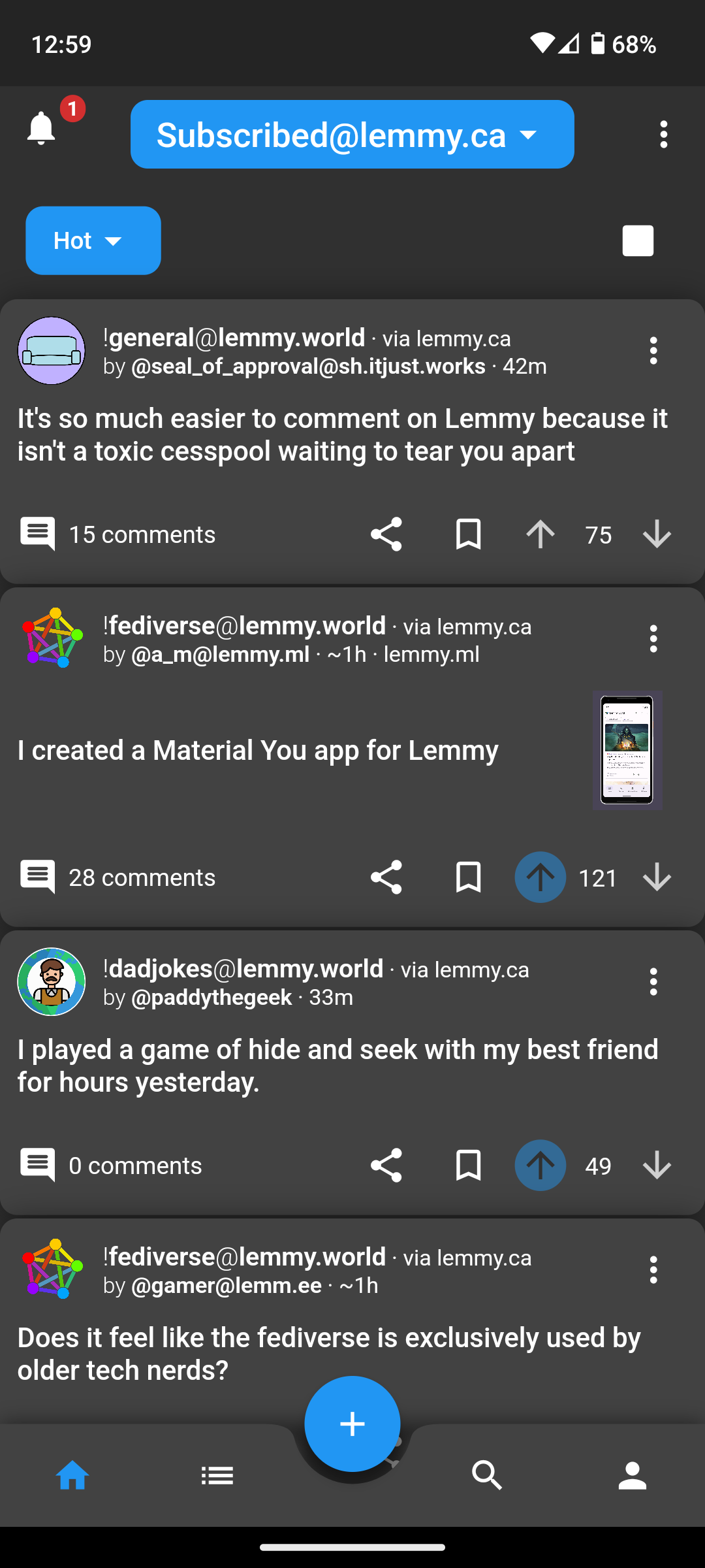
Here is iOS dark / compact
IMHO, the shadows, padding around cards, corner radiuses, drop down stylings, etc. are all pretty rough. It doesn’t feel as refined as Material You or iOS’s design system.

After driving in Memmy, Mlem, and Wefwef (now Voyager), Liftoff feels kind of janky to me.
Just my 2¢
Just popping in to mention the UI got a pretty big update recently. You might want to take another look, I think its a lot better now.
If you go into settings and turn off card shadows and rounded corners it gets a bit better IMO
Oh god, that’s way better. That stuff should be off by default. That said, I still feel like they need a UI person to contribute, and OP should hit them up.
As someone who does UI for a living, it feels rough to me. I wish I had the time to help out, but I’ve already got a couple other nasty side projects on my plate.
Memmy on iOS has been great so far.
Have a look at https://lemmyapps.netlify.app/ or https://lemmy.world/post/465785
I’m really enjoying wefwef. It’s smooth and works well. No weirdness or issues on my end.
I’m currently using connect for lemmy. It works fine, but I still have to use the web version to jumping between servers, which is why I come up with this idea.
Hmm, connect let’s me switch between accounts on different instances just fine.
yeah, I’m just too lazy to create account for every servers I find interesting, especially when the different between them are minor
Wow that front page looks like sync 😁
lol, I use basic components from material library so it should be familiar :)))


