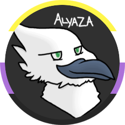
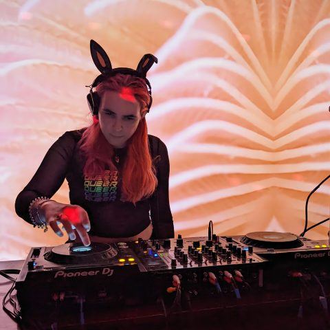
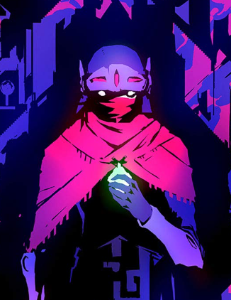
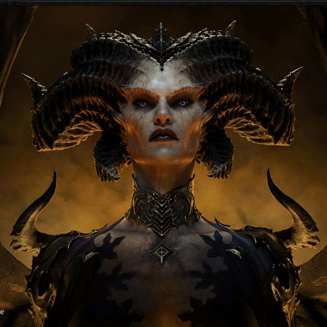
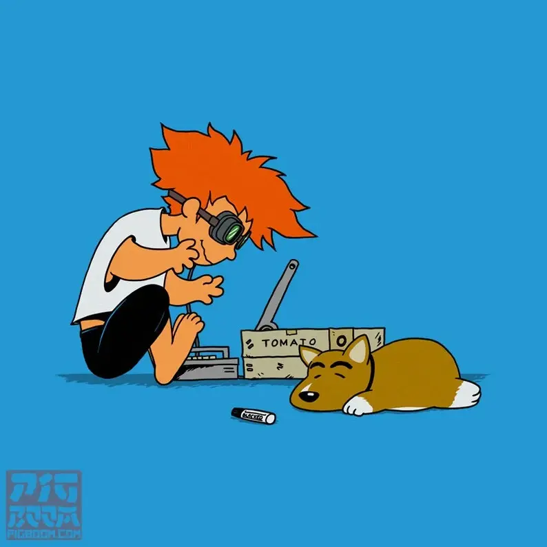
hey folks, quick update to say you’ve probably noticed our new community icons.
these icons were lovingly crafted by @UrLogicFails@beehaw.org, who posted them a couple of days ago over in Creative. we took notice of them and obviously–because they’re our community icons now–really, really liked them.
thanks to his generosity in working things out with us, we’re pleased to announce we can use his icons under a Creative Commons license for the site! until further notice they’ll be our site icons, with credit to him on our sidebars. we’ll also be adding attribution to the community sidebars over the rest of day as time permits.
we’re also pleased to report that, thanks to your generosity, we’ve been able to reasonably compensate him for all 33 of the icons he’s made for the community! the agreed to rate is $5 per icon, for a total of $165 that’s been paid out to him as of today. this expense has been reflected on our Open Collective. (we’ve also agreed to, as possible, commission him for any future community icons until further notice, which will be subject to that same rate.)
hopefully you enjoy the new icons, and please thank UrLogicFails for the work here! thanks for using the site again folks!
I think this is the first time that I saw someone’s voluntary art work compensated after being implemented in a community. The transparency is surreal and very admirable. Thank you for compensating artists and valuing the art that @UrLogicFails@beehaw.org made c:
Said this in a private chat, but I’ll repeat it here for transparency
While we can’t guarantee anything with regards to donations, I will always vote to pay artists even if it meant we had to go begging for donos to help run the site later
Agreed! The icons are great, and the open compensation and transparency is lovely as well.
I love the new icons, it’s much easier for me to immediately identify which communities are beehaw vs not-beehaw in jerboa.
Yes, a distinct theme will help remind people from other instances to beehave when they participate on ours 😄
One thing I just noticed: some of the community sidebars have a blurb about the icons’ authorship and licensing, but the license link may need to be clarified. On Gaming and Technology, for example, the text of the link says CC BY 4.0, but the underlying link points to CC BY-SA 4.0.
working on it lol, most of them don’t even have it yet
Yes! Love seeing where home is at a glance~ they’re beautiful ! 💕
Thank you @alyaza@beehaw.org and the rest of the Beehaw admin team. You all have been so welcoming (not just to me, but to everyone), and I look forward to working with you more in the future!
I love the icons! Congrats! I’m looking forward to seeing what you come up with for future new communities.
Love the style!
Now how do we integrate a hive into the iconography?!? ;)

I feel like there’s genuinely a lot of room to play with bee iconography including the hive, the honey comb, honey dipper, and of course the bees themselves.
I don’t know how all of the iconography will come into play, but I’m definitely excited by the possibilities
Don’t forget the boots, spurs, and hats!
The icons are great! The honeycomb shape is really cool, I love it
Congrats, @UrLogicFails@beehaw.org!
The transparency of expenses really helps bolster trust and it’s awesome we’re compensating an artist for their work! Gives a little bit of hope.
Agreed! I know many would contribute for free to help the server, but art is so chronically underpaid.
And the amount of times we hear people trying to get out of paying the artist or designer…it really put me off trying to freelance as an artist (not to mention the anxiety making art brought me lately…)
yOu’Re GeTtiNg eXpOsUrE FrOm Us
Noticed them immediately! I love yellow accents on things, and fits right into the bee theme being a hexagon (bestagon) and all.
I see you’re a person of taste
chef’s kiss on the new icons. I love the honeycomb design, it’s super easily recognizable.
deleted by creator
The icons are gorgeous, and I like the idea that Beehaw basically has “branding” on their communities. This proves a visual clue to folks new to a fediverse where a particular community is coming from. It would be nice if more servers did similar.
I wonder if at a future point, folks who signed up on Beehaw as their “home server” could get a yellow hexagon frame for their avatar. It would help visually unite and convey the idea of the user and their local environment while reinforcing the idea of what a fediverse does.
I love the icons and I am fully behind making sure the artist is paid. Win win! :)
Yay and not just with “exposure”, as is so often the case with artists trying to make a living.
I like the consistency! good job admins and @UrLogicFails@beehaw.org!
The icons look great!
They look great! They really tie the room together.
They really pop out nicely!
This post right here has convinced me that Beehaw is something special. It makes me so happy to see the community respected in this way
These icons are a great way to identify the local Beehaw communities.
